22% annualized churn
The biggest business problem Vet Radar faced was it had a very high churn rate. It was a multi-faceted problem costing the business a lot of reoccurring revenue.
-25 NPS score
Usability is core to a product like Vet Radar. The use cases are so hands-on and vet practices get pretty intense and fast-paced, so the software needs to be fluid.
Unfortunately, our NPS reveals that the product is not meeting our customer’s expectations.
Negative perception
While we had made significant strides to improve Vet Radar and have advocate customers who love Vet Radar, we still received negative sentiments.
This incurred lost sales as we would lose out to competitors.
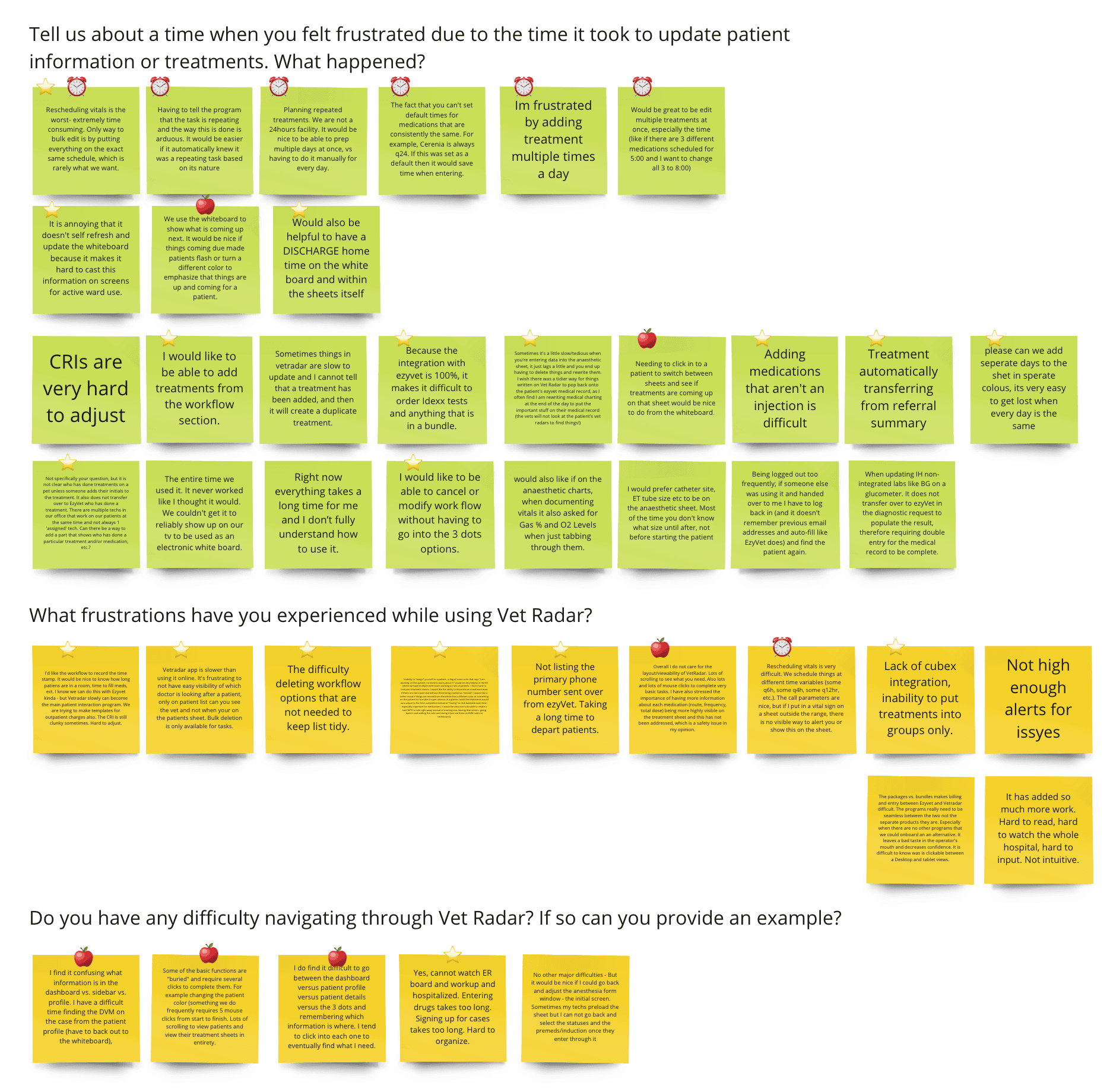
60% of our NPS comments mention usability.
“So many clicks and pages to do things, not user-friendly at all”
We often talk to our customers and use Dovetail to document and syntheize our research. We noticed a trend where users voice ambiguous problems around the software taking too many steps to do things and difficult to navigate around.
Veterinary clinicians face immense pressure and stress amidst an industry facing burnout and global staff shortages. Vet Radar has an amazing opportunity to help, yet the app is not meeting customer's expectations.
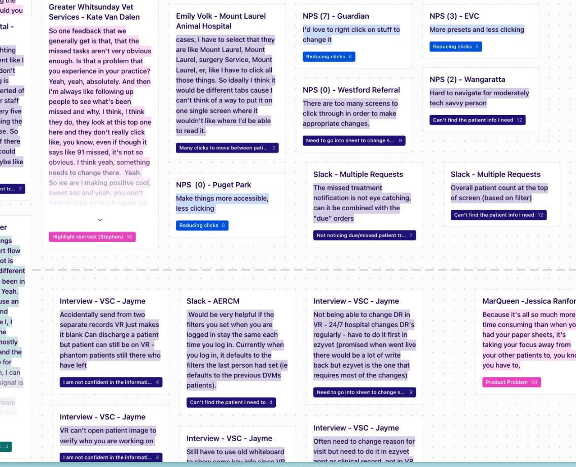
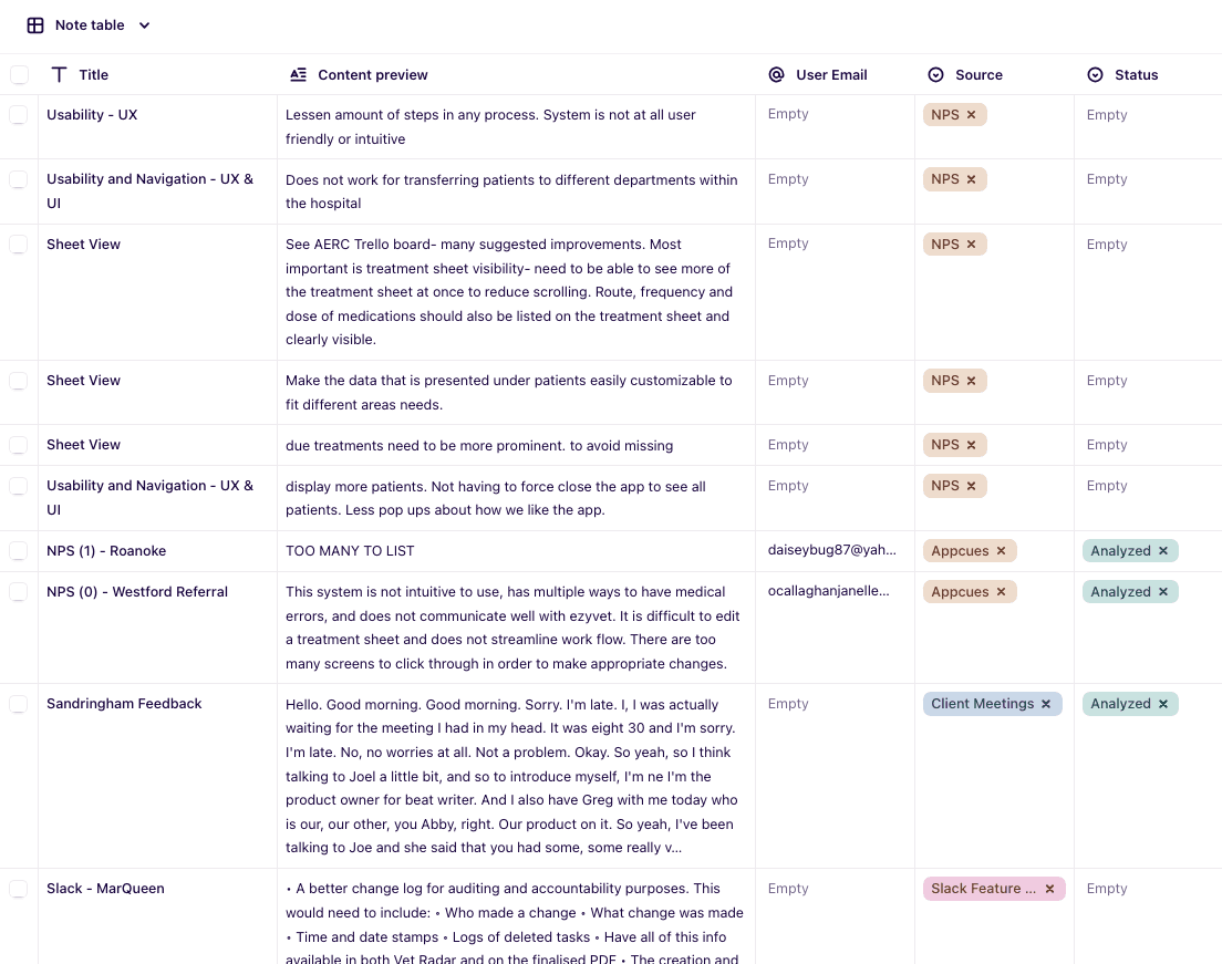
Example screenshots of our Dovetail research
Problem statement
Clinicians are understaffed and busy. Vet Radar requires excessive steps and navigation.
For customers, this means wasted time and increased stress. For the business, this contributes to a negative NPS, and a high churn rate.
Success measure
Leading indicator: Reduce time to common workflows by 50%
Lagging indicator: Reduce churn by 10% (22% to 19.8%)
Qualitative feedback (We stopped measuring NPS as it had high fluctuation)
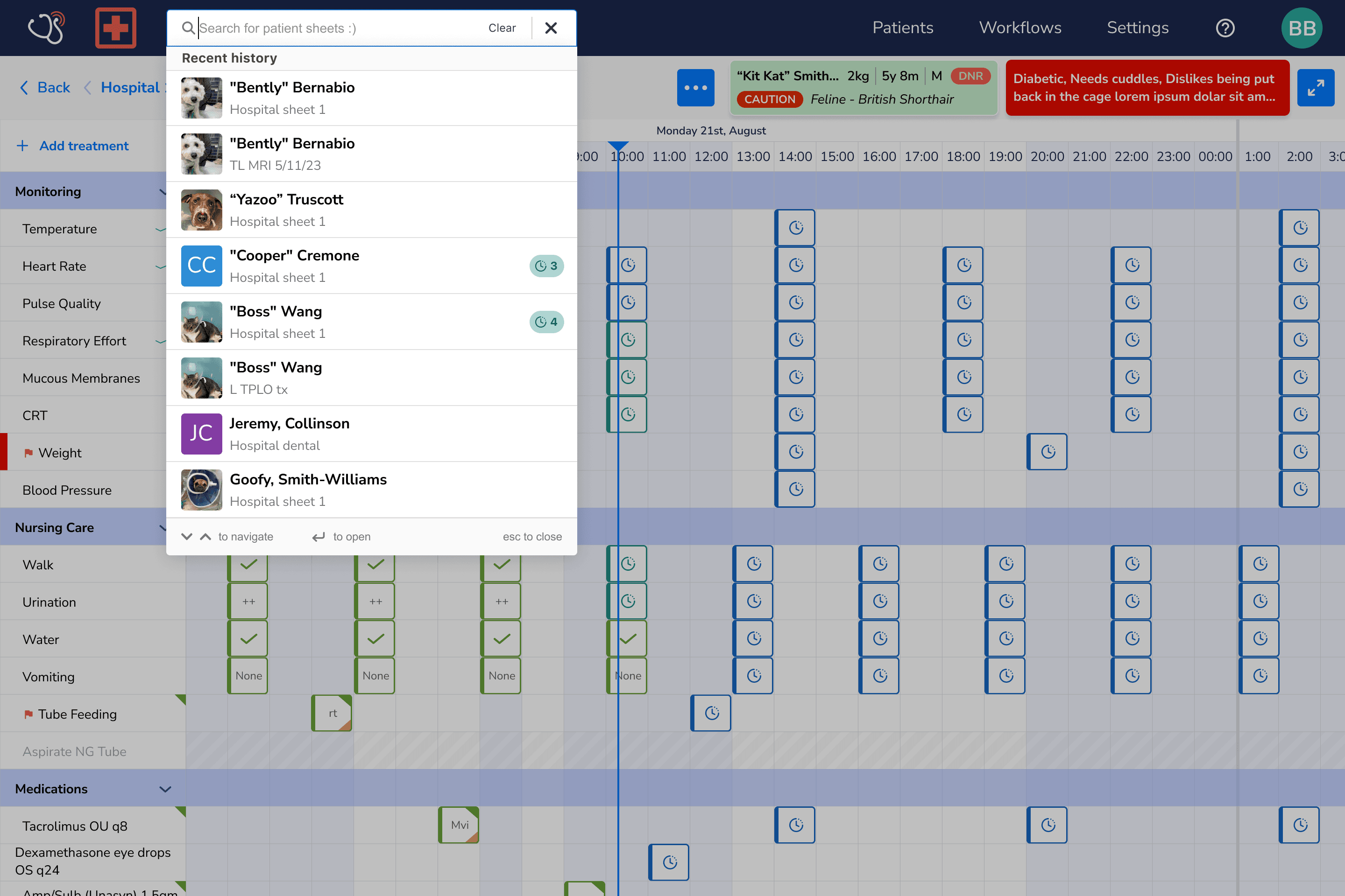
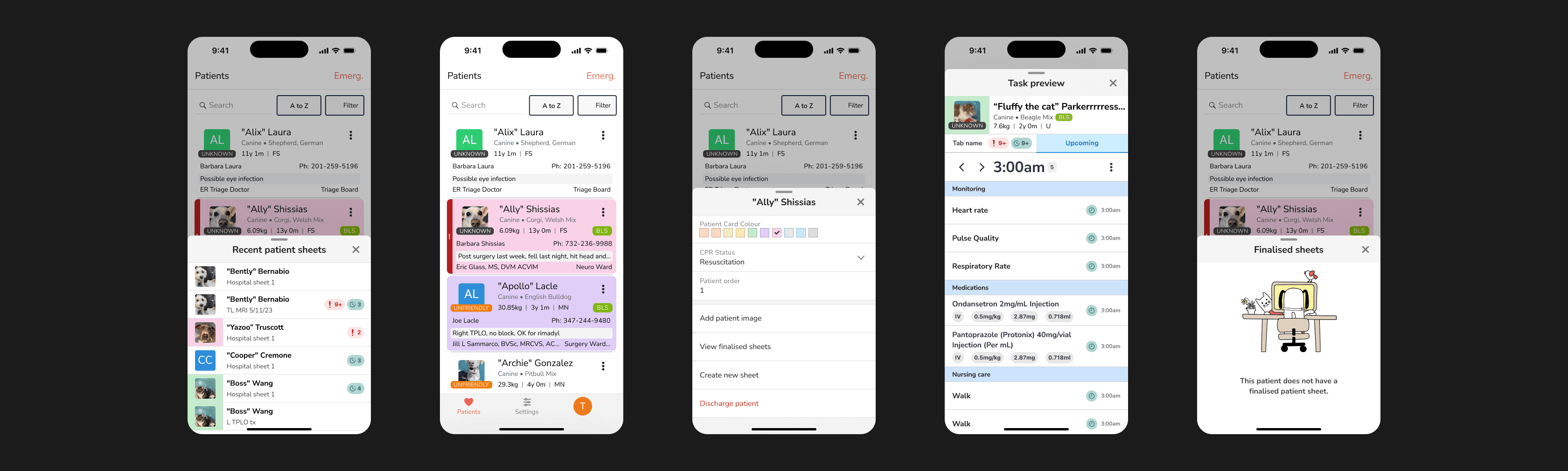
Early exploration of "Global Search" idea
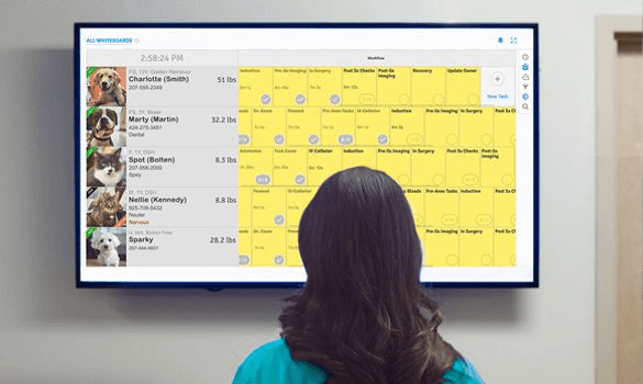
Early wireframe of a reimagined whiteboard
Appcues
We put out an in-app questionnaire to a small % of our users.
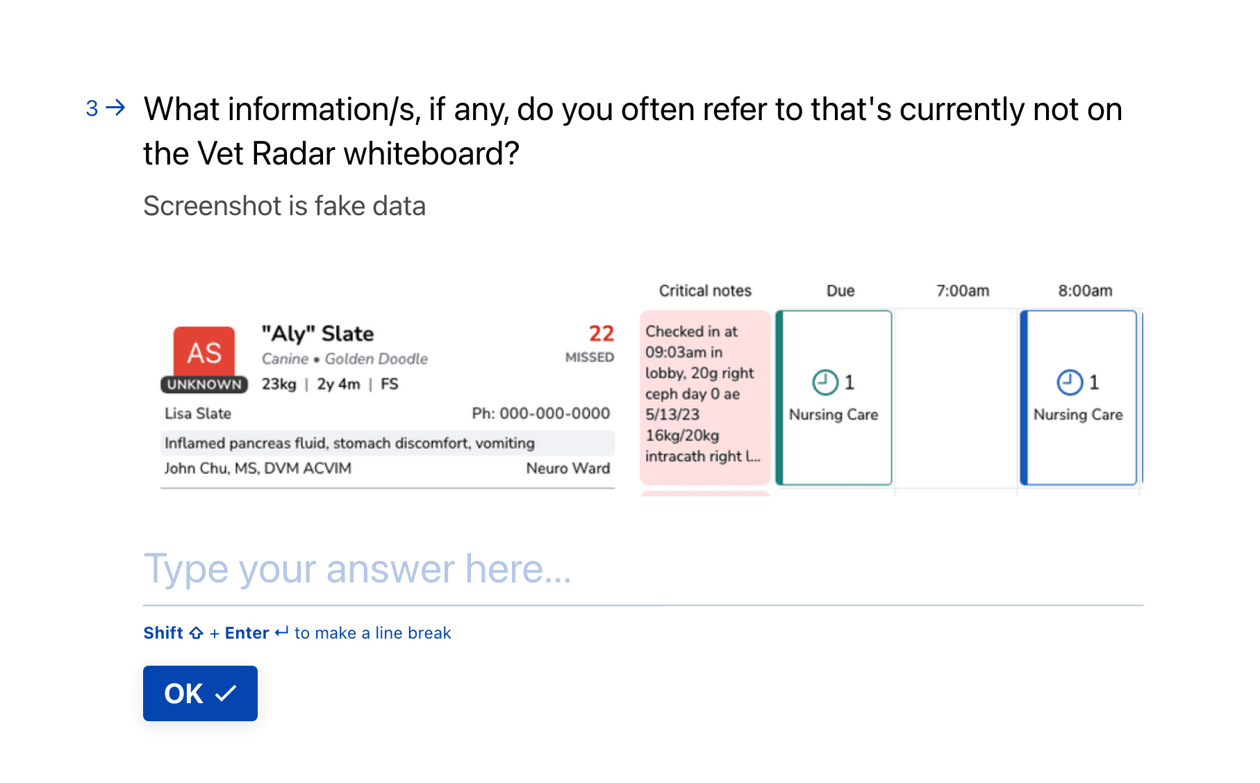
38% of responses said they were solely looking for information not displayed on the whiteboard (n=77).
The vast majority of respondents who were finding information were checking for the exact due treatments that were due. Watching the session recordings matched with their statements.
Survey
We sent a survey with veterinary clinicians to validate our assumptions on what information users wanted to refer to on the whiteboard. We also learned what specific workflows via the whiteboard was tedious, and various other pain points related to the whiteboard.
Here are a selection of screenshots from the survey. (n=41)

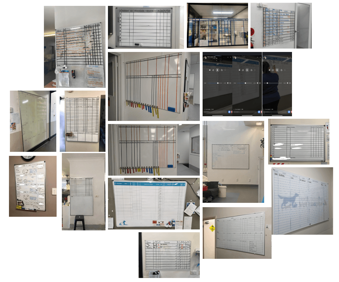
Online forums
Through social media, we studied and analyzed a collection of physical whiteboards. We learned the main JTBD for the whiteboard: Why the pet is here, what’s happening in the room, and what priorities can be helped with. We also learned that most traditional whiteboards aren't too different from each other, and a lot of what customers were asking to be shown on the whiteboard aren't on traditional ones.
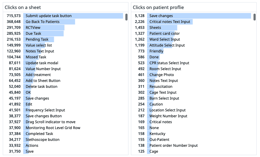
Quant data
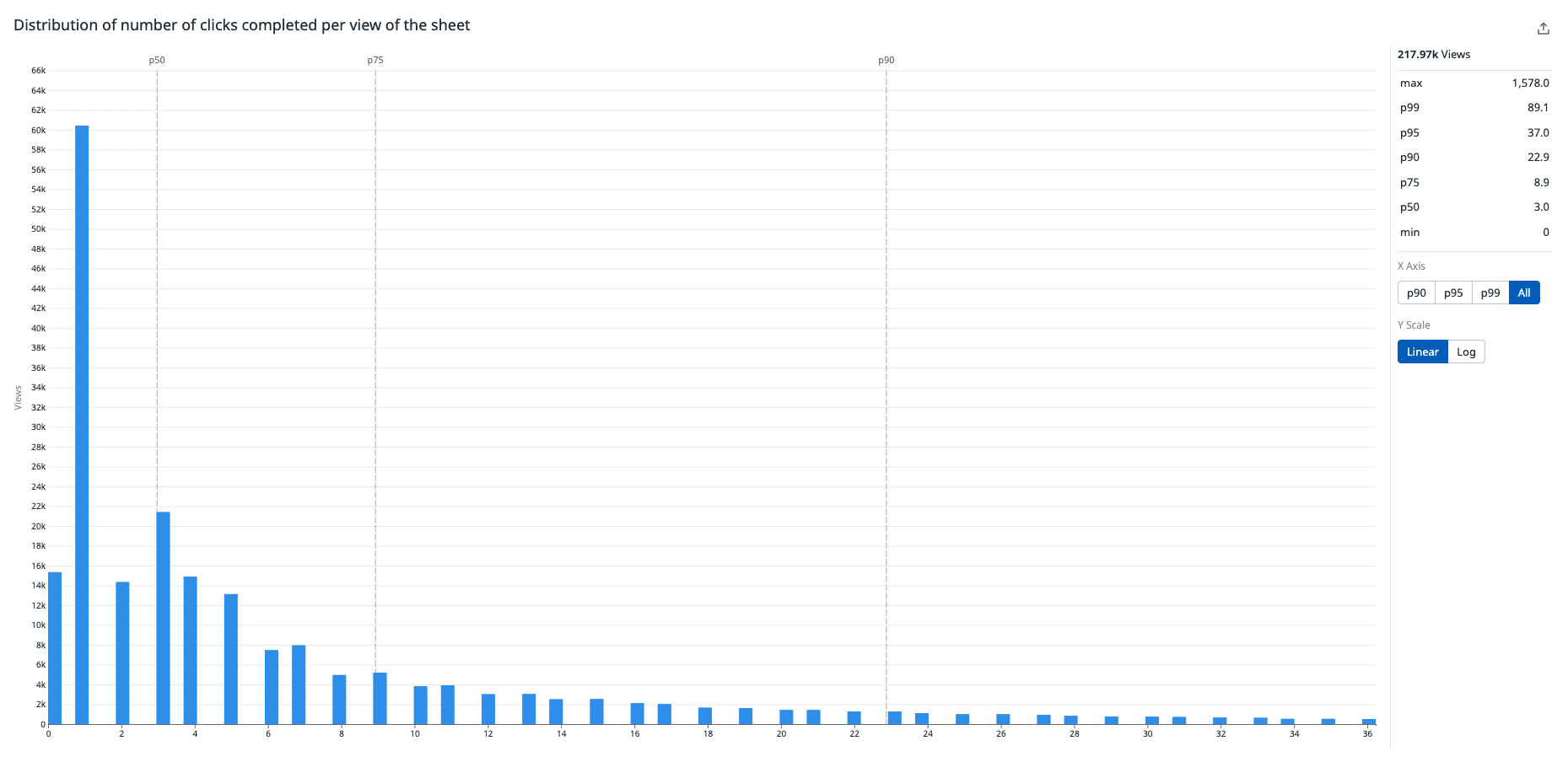
Utilizing Datadog, quantitative data helped fully validate exactly what were the most common actions being performed on the patient sheet. I also learned that 50% of treatment sheet sessions are spent with 5 seconds or less and 30% of whiteboard sessions are spent with 5 seconds or less. The way I interpret this is users are spending “low-quality sessions,” resulting in a very jarring navigational experience.
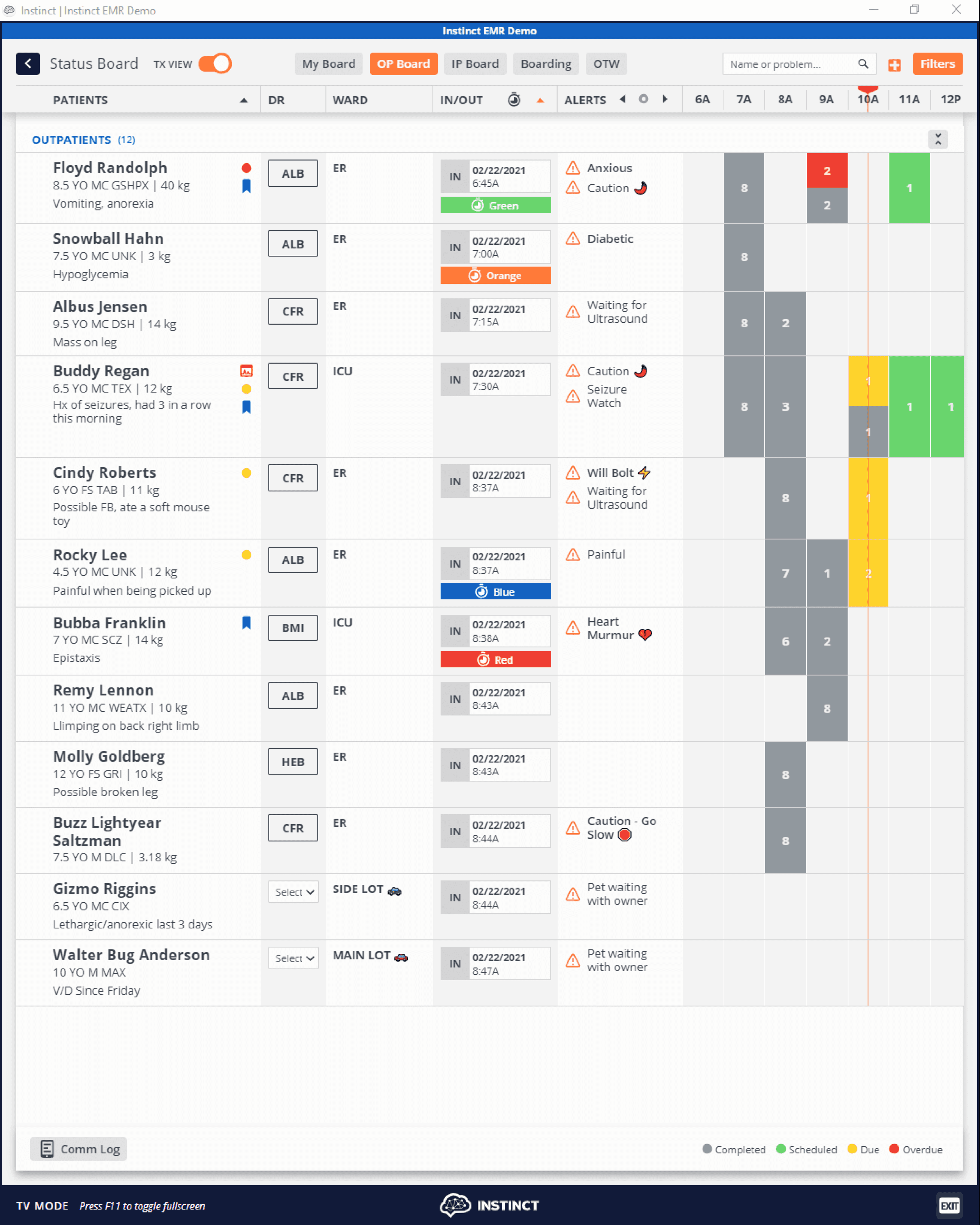
Competitive analysis
Studying competitors gave us insight into how other digital whiteboards worked, and how they approach solving the problems I was looking to solve. Smartflow allowed full customization of fields. Instinct had a toggle to switch between two different views.